
The brief
Mobeus has evolved and out-grown their launch identity. They required a brand for today that represented Mobeus as one team. but with two different and yet complementary investment strategies: Buyout and Growth.
This project was a refresh of all the major elements of their brand, whilst retaining the name (albeit shortened) and the mark and was seen internally as ‘evolution’, rather than ‘revolution’.
The solution
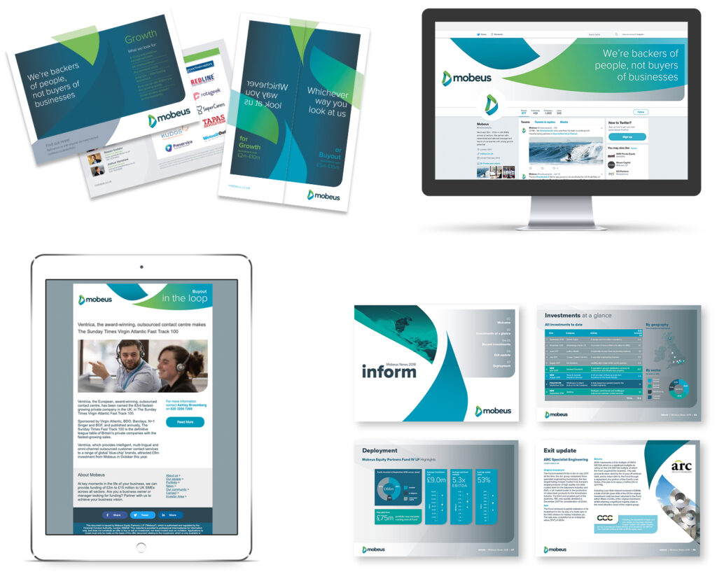
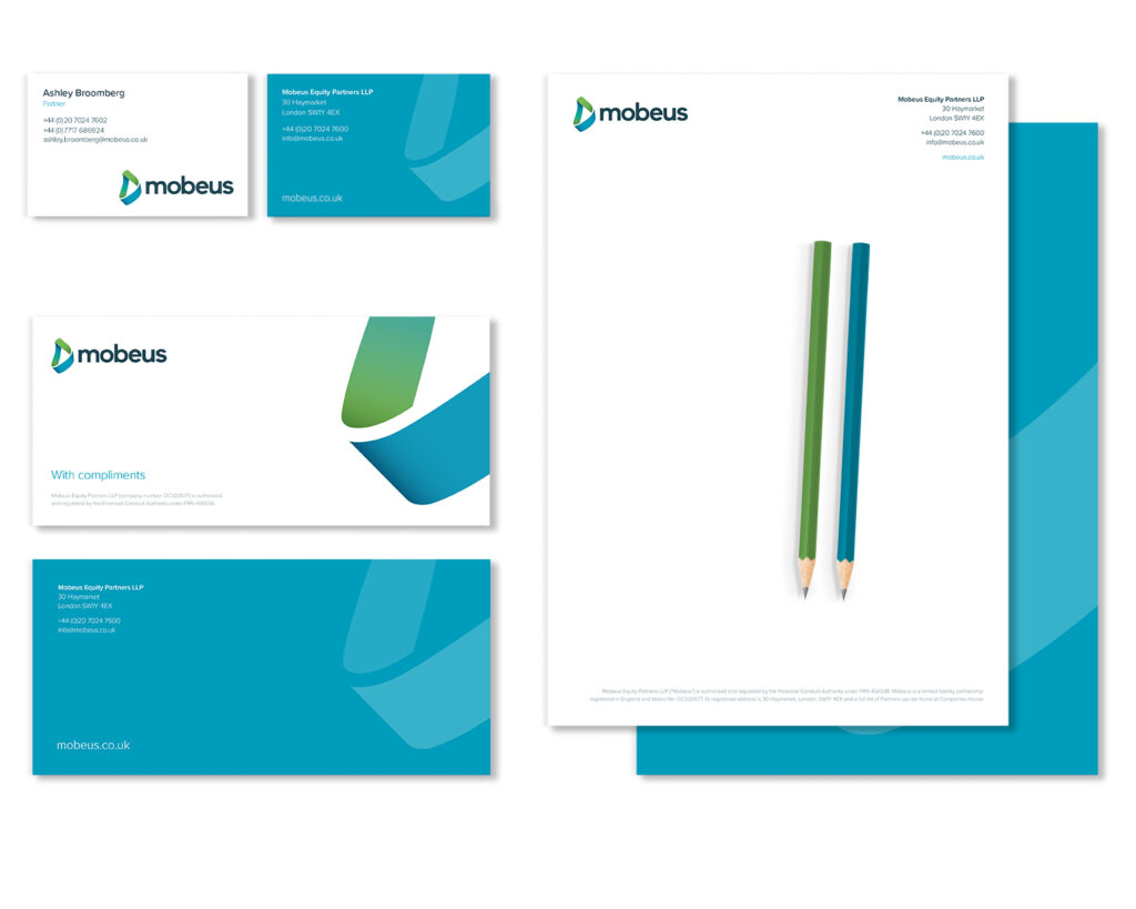
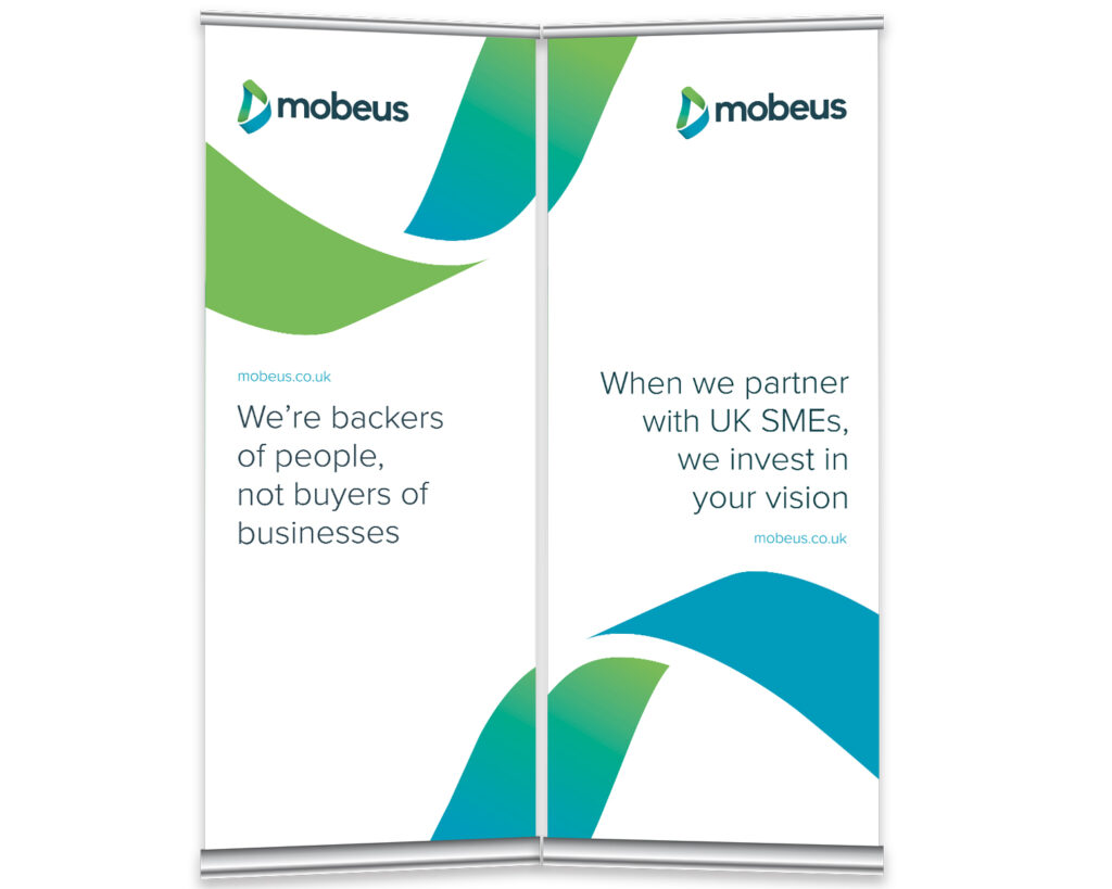
We refreshed all the key components of the brand – logo, typefaces and image style – whilst adding new vibrant colours to highlight the Growth offering and the ‘zooms’, which are a dynamic, fluid shape, created from enlarged sections of the Mobeus mark.
The results
A new, coherent brand identity has now been launched to communicate their brand values, through social media assets, business stationery, pull-up exhibition stands, email newsletter templates, various printed collateral and a new custom-built website (mobeus.co.uk). All of this has been brought together, together with usage guidelines, in the new Mobeus Brand Book.