

We were asked to create a modern fresh identity, while still maintaining the heritage and feel of the already successful and recognisable logotype.
We considered typefaces to use on print and the website to create more interest and impact. We also explored subtle changes to tones on the existing colour pallete to maintain consistency and brand loyalty.
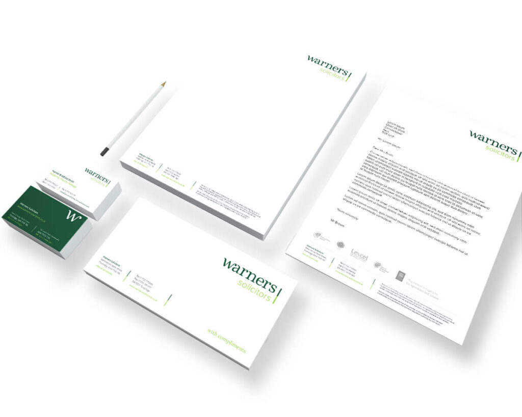
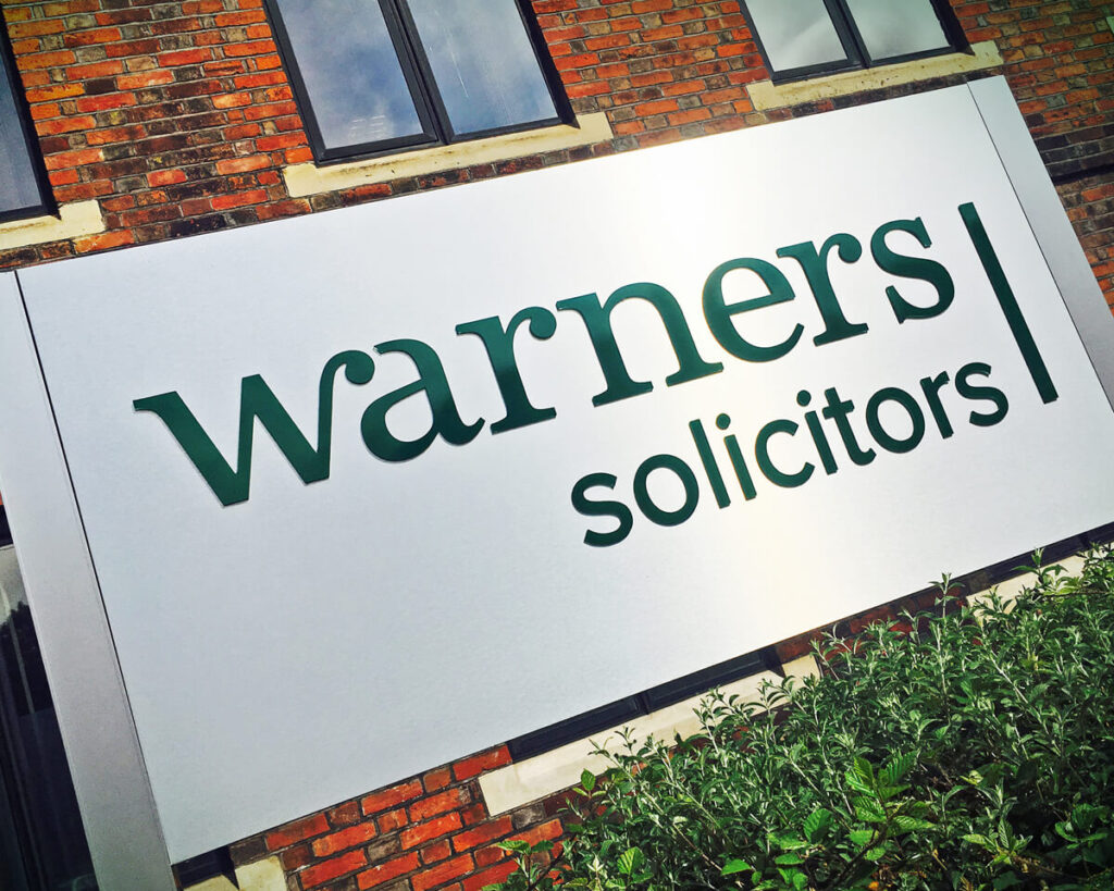
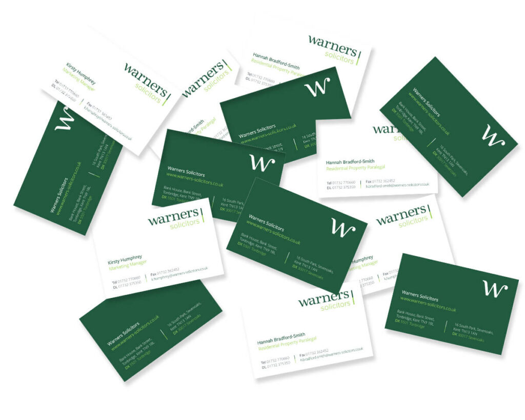
In the final chosen logotype, we used a combination of a distinctive serif and simple sans serif in lower case for a more contemporary and friendly impression. Linking the ‘w’ and ‘a’ serifs gave the logotype individuality, and the overall brand, the extra character and impact that was part of the initial brief. To complete the brand refresh, business cards, stationery, signage and brochure templates were designed to complement the new modern identity for Warners.