The Brief
Clinicare is a leading supplier of healtcare products. They are looking to expand into new sectors increase the size of their product range.
Cura is brand of gloves and wipes used in the helathcare sector
The existing Cura brand had become tired and dated and we were approached to produce a complete refresh brand.
The Solution
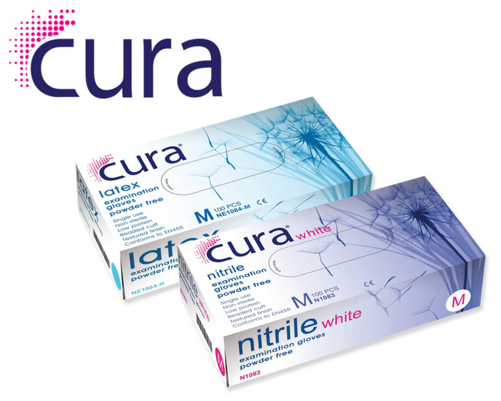
The Cura log was the first consideration. We wanted a distinct, yet appealing identity that reflected environment that they would be used.
In addition there would be growing range of cura products and consideration had to given on how the product packing would look too.
Using a modern font clear font and gentle illustrations we created a logo that was clearly individual that would not only stand out on packaging, but a logo that had a character of it’s own.
The blue symbolises the trust and faith that the cura products bring.
The packaging had to be friendly and promote the softness that is the product appeal.
Using images from nature across the cura range, we promote healing and wellbeing.
The Result
The brand refresh was a complete success. The profile of all cura products was significantly increased, and it helped Clinicare reach its significant growth targets.
Further cura products are now planned.
